
Property lead forms that convert: intent, not field count
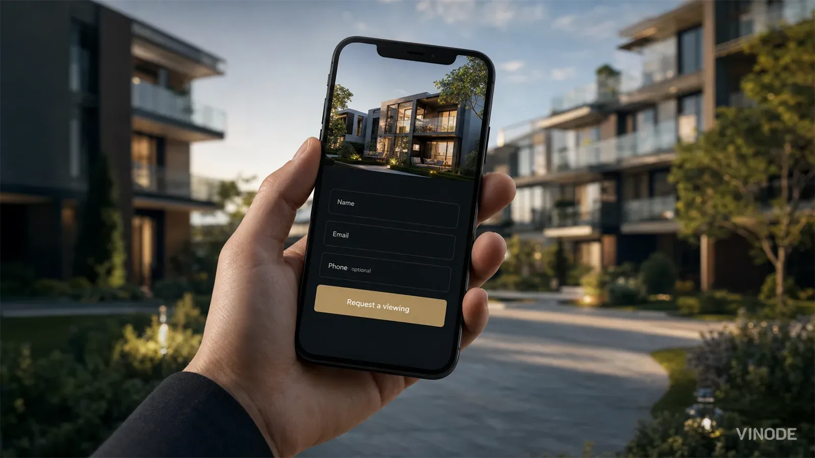
Image co-authored with help of AI for illustrative purposes
Key Takeaways
- Intent, not field count, decides whether a property enquiry form converts.
- Keep the phone number optional for a first-touch visitor, and require it only when the buyer has already asked to be called.
- Qualify buyers by what they clicked before adding fields; the shortest form is one the page already answered.
- Word trust copy positively and place it beside the field the buyer balks at, because 'we will never spam you' plants the doubt it means to remove.
A marketing lead prepping a development launch opens the enquiry form and counts six fields: email, first name, last name, company, phone, and a box for the project. The reflex is immediate. Cut it. Drop to three, maybe two. Lighter form, more submissions, everyone knows this.
The trouble is that the reflex optimizes the wrong variable. It treats how many fields as the thing that decides whether a buyer submits, when the real lever is how much intent that buyer has already shown by the time they reach the form.
Two form-field studies that only look like they disagree
HubSpot studied more than 40,000 of its customers' landing pages and found that forms asking for age, a phone number, or a street address converted worse than forms that skipped them (HubSpot). That is a finding about which fields you ask for. Zuko, running analytics across thousands of live forms, reports something that sounds like the opposite: the raw number of fields is barely correlated with completion rate at all (Zuko).
They agree once you stop reading count as the cause. A field a serious buyer expects to fill in costs almost nothing. A field that reads as nosy or premature can cost the whole submission. What matters is the identity of each field, and whether this particular person has already shown they will answer it.
Across Zuko's benchmark, phone sits among the highest-abandonment common fields, roughly level with email and behind only passwords. (Zuko)
The phone number is the hard case
No field carries more of this tension than the phone number. On a first-touch form, from someone who landed twenty seconds ago and is still deciding whether the development is worth a second look, a required phone field reads as a sales trap. The friction is mechanical too. Zuko's breakdown of the phone field found that 89% of entries arrive in a format the form does not expect, which turns a validation error into an exit (Zuko).
Put the same field on a 'request a valuation' or 'book a viewing' form and it stops being friction. Someone asking for a callback wants to be called, so requiring the number matches what they came to do. There is no single rule for the phone field. Make it optional on first-touch forms, and require it only where the buyer has already signalled that kind of intent.
There is a tradeoff to accept out loud. An optional phone field means fewer numbers collected, and the ones you do collect belong to warmer leads. Sales calls fewer people and calls them better. If your team is measured on how many dials it makes, they will resist this. Have that argument before the form goes live.
Phone number: when to ask
First-touch, low intent
A visitor who landed a minute ago and hasn't signalled they want to be contacted. Make phone optional, or leave it off. What you want is the email and permission to follow up.
High intent, self-selected
A buyer requesting a viewing, a valuation, or a callback. The phone number is expected here, because a callback is the whole reason they filled the form out.
Qualify by behaviour before you add a field
The highest-leverage way to shorten a property form is not to delete fields. It is to move the qualifying off the form and into what the buyer already did. If the experience knows which unit they opened, which floor plan they lingered on, and which filters they set, the form does not need to ask any of it.
This also puts the 'always reduce' rule in its place. In one documented test, cutting a form from nine fields to six actually reduced conversions, because the fields removed were the ones engaged buyers cared about; rewording the labels on the original nine-field form lifted completions by 19.2% instead (CXL). A field earns its place on whether the buyer expected to answer it, and the clearest field to cut is one they already answered with their clicks.
This is where an interactive experience earns its place over a static page. When a buyer configures finishes, parking, and financing on a specific unit before they reach a form, the submission arrives already attached to that unit and to a real level of seriousness. We covered the sales-cycle side of this in interactive floor plans. The form gets shorter because the page did the interviewing.
Our own data backs the mechanism. When one developer switched to a page where buyers self-qualify before the form, property-detail-page-to-lead conversion rose from 4.0% to 6.7%. One client, one campaign (n=1) - the whole experience changed, not the form alone.
Source: Vinode measurement - as of
You will see the claim that multi-step forms convert up to 300% better. It traces from one blog post to another, not to anything you can stand on. The defensible version is smaller: splitting a long form into steps can lower its perceived effort, and it can also cost you taps on mobile. Keep it single-step under about five fields, and test the split past that rather than inheriting it.
Trust copy beside the submit button cuts both ways
The reassurance line beside your submit button is not decoration, and it can hurt as easily as it helps. In a test CXL documents, an opt-in line reading 'we will never spam you' reduced sign-ups by 18.7%, while rewording the same promise to 'we guarantee 100% privacy' increased them by 19.5% (CXL). The word 'spam' planted the very doubt it was trying to remove.
So word the guarantee positively, and put it where the hesitation actually happens, beside the field or button the buyer balks at rather than on a testimonials page they will never scroll to. The moment after submit matters too. A dead 'thanks, we'll be in touch' page wastes the highest-intent second you will ever get. Set the next expectation, tell them when they will hear back, and if you can, hand them something. For a buyer who was configuring a unit, the natural payload is a PDF of that exact unit, its floor plan and current price, generated on submit.
Reassurance copy is the most overconfident writing on any form. Everyone assumes their friendly line reads as friendly, and the buyer is the only one whose reading counts.
Our own form, and what's wrong with it
We should hold our own form to all of this, because it fails parts of it. Vinode's live 'Tell Us About Your Project' form asks for the same six fields the marketing lead counted at the top of this piece. None is marked required in the markup, so the phone number ends up optional without anyone deciding it should be. The default is right; the reason it is right is luck.
The phone field has a worse problem. The markup declares it as plain text. On a phone, that hands the buyer the full alphabetic keyboard where a telephone input would have given them a number pad, and it does so on the one field where that friction is most expensive and most avoidable. The fields are placeholder-only, with no visible labels, an accessibility gap we are fixing in the rebuild. What we did get right, almost in spite of the markup, is a book-a-call link sitting beside the form, a higher-intent path for the buyer who is past 'tell us about your project' and wants to talk now.
A type="text" phone field gives no numeric keypad on mobile. Zuko's benchmark shows completion running 47% on desktop against 42% on mobile across the same forms, a gap built from exactly these mechanical frictions. Changing one attribute to type="tel" costs nothing and removes one of them. (Zuko)
The form is only as reachable as the page
Every piece of form advice assumes the buyer reaches the form. On a heavy real-time 3D page that computes each frame on the visitor's device, plenty of them never do. The experience is only as fast as the phone in the buyer's hand, and on an older phone that often means a loading spinner sitting where the form should be. You can perfect the field copy on a page people abandon before it renders, and the copy will not save you. Reachability is a conversion factor, and it is missing from every form-optimization checklist.
This is the honest reason our forms sit on pages that load in one to two seconds. The 3D is pre-rendered and streamed rather than computed on the device, so the surrounding experience does not tax the phone it opens on, and the form is present and interactive while a heavier page is still spinning.
Pre-rendered and streamed, so a low-powered phone reaches the form instead of watching a loader. (Vinode-published.)
How the form changes with development size
The right form for a six-unit boutique project and the one a 500-unit development needs are not the same form. Safa Al Fursan in Riyadh spans 528 units across a 67,000 m² site. You do not capture intent there with one enquiry box. Buyers filter by building, floor, size, and orientation first, self-selecting down to the handful of units they actually want, and only then does a form make sense. A six-unit project is the opposite case. Instrumenting it like a masterplan is over-engineering; one clean enquiry form is the whole job.
There is a quieter B2B question underneath all of this: who owns the form after launch. A form only a developer can change ossifies the day the sales team wants a new field and cannot add it. That is why the form belongs in a no-code builder, editable by the people who actually run the campaigns, with submissions flowing straight into the CRM. We made the broader version of that argument in launching a microsite in two weeks.

What to change on your enquiry form first
Stop opening the conversation with 'how many fields should this form have.' There is no universal answer, and chasing one is how you end up cutting the field an engaged buyer wanted to fill in. Start instead from how much intent the buyer has shown, and where, and let the field count fall out of that. Do that consistently and the form stops being a toll gate you keep trying to make cheaper. It becomes the last and smallest step of an experience that already did the persuading, and the count of fields on it stops being a question you have to answer at all.
One caveat on who this is for. A considered off-plan property purchase is not an impulse checkout. The playbooks written for e-commerce carts, obsessed with shaving a form to a single field and firing the buyer through in seconds, are tuned for a decision made in the moment. A buyer choosing where to live for the next decade is a different buyer, and the form should respect that difference instead of rushing it.
See a form that qualifies before it asks
Explore a live Vinode project and see how much a form can skip once the page has already qualified the buyer.

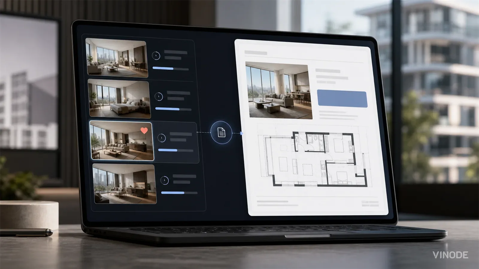
The Unit-Specific PDF a Buyer Actually Asked For
A buyer spends nineteen minutes on one two-bed, saves it, and gets the forty-one-page development brochure the next morning. Once a sales platform records the unit a buyer chose, the generic brochure becomes a decision to ignore that choice.

Expression of interest before release day: capture unit demand
640 names and no idea which side of the building they want. An expression of interest campaign pays off when the form is joined to the units each buyer explored, and each of these checks has a pass, a fail and a cost.

We measured when a pipeline crosses the presale line, not just whether it will
When GTHA opening-quarter absorption averaged 66%, the sold percentage was enough to forecast a presale crossing date. Then absorption fell to 17%. Three pipeline inputs produce the crossing date your lender asks for: stage-conversion rates, a cancellation haircut, and remaining inventory.