
What Changes on a New-Development Sales Floor When You Switch to Interactive 3D
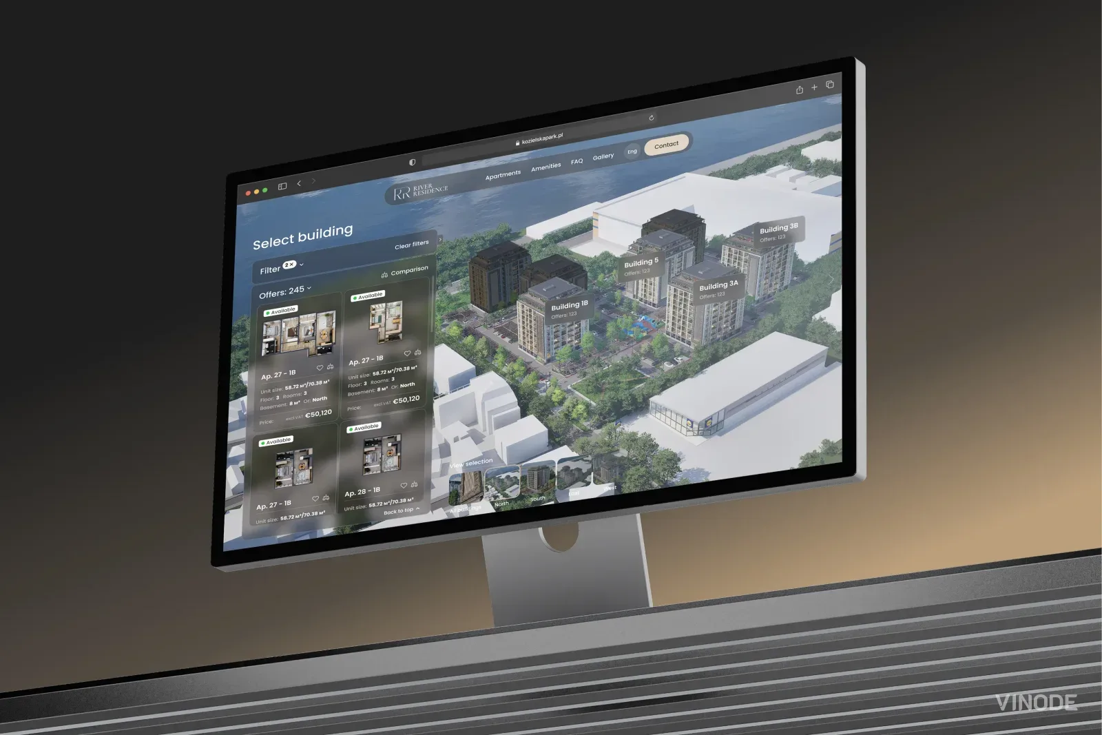
Image co-authored with help of AI for illustrative purposes
Key Takeaways
- The agent sits beside the buyer and drives one shared screen through the whole catalogue, instead of presenting fixed boards.
- Listings are data-bound, so a sold unit disappears from every page and filter at once, and the per-unit take-home PDF regenerates instead of being reprinted.
- The buyer still cannot reserve or pay in the browser, so plan the close as a human step where the agent marks the unit and captures the lead.
- The floor changes materially only from the Standard tier up, where the offline kiosk ships; a six-unit block gets the tool but keeps roughly the same room.
Watch a new-development sales floor for an hour before the switch and you keep seeing the same small errand. A buyer asks about the corner unit on the eighth floor, and the agent gets up, crosses to the plan chest or the easel, pulls out a printed render or a foam board, carries it back, and starts explaining what the buyer is looking at. The render shows one apartment, in one finish, from one angle. If the question moves to the floor below, or a different orientation, or the two-bedroom instead of the three, that is another trip and another board.
That errand is the thing that disappears. Interactive 3D gets pitched as a way to wow buyers, a slicker, more cinematic version of the walkthrough. On the floor, the change is quieter and more useful than the pitch suggests.
Almost every conversion or ROI figure you will read about interactive 3D for real estate is published by a firm that sells the tech. We could not find an independent study that holds up. So this piece sticks to what the tool changes in the room and what we can actually measure, and it flags every number's source. The one first-party result we cite is a single client, and we say so plainly.
The parts worth deciding on are operational, and there are three of them: where the agent sits during a viewing, the upkeep that stops being manual, and the moment the deal actually closes. Take those one at a time.
The conversation changes: the agent sits down
Before the switch, the agent is a presenter. They stand, they hold the material, they walk the buyer through a fixed set of views in a fixed order. The buyer watches. After the switch, the agent and the buyer are looking at one shared screen, usually a large touchscreen in the office or a browser on a tablet between them, and the buyer starts driving. They filter the available units by building, floor, size, orientation, price range, and extras like a terrace or parking, and they open the ones they care about. The agent moves from presenter to co-pilot, prompting and answering and narrowing as the buyer picks the path.
That shift shows up in the data. On one of our developments, over a run of ordinary traffic, visitors opened more than seventy individual apartments inside a single building rather than being walked through a curated handful (Vinode GA4, one anonymized development). People explore like that when the inventory is theirs to open. My own bias, from years of watching people use interfaces: once a buyer takes the controls they start shopping in earnest, and that digging is the behavior the seventy-apartment figure captures. The screen also lets a single unit change in front of them. On River Residence, where an interactive sales engine replaced the PDF, a buyer can switch between three complete interior styles in one click, mid-tour, without the agent leaving the chair or reaching for a second board.
The maintenance stops being manual
The part of the floor that changes most quietly is the upkeep. On a printed floor, a unit going under offer means someone reprints a price sheet, restickers a board, and hopes the version on the easel matches the version in the spreadsheet. Prices drift out of date between reprints. Somebody always shows a buyer a unit that sold last week.
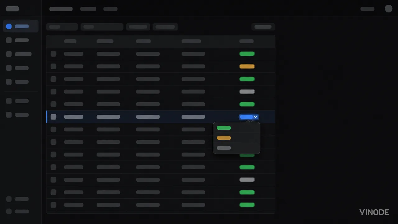
With the units bound to the Back Panel, that maintenance turns into a status change. An advisor marks a unit reserved or sold once, and it cascades: it stops showing as available on every page and every filter, with nothing reprinted. The take-home brochure is the same story. Instead of a printed batch that goes stale, the per-unit PDF regenerates each time with the current price, the buyer's selected finishes, and the details for the exact apartment they were looking at. Meanwhile the purpose-built new-build CRM quietly records which units this buyer opened and how long they spent, and links that back to the lead when a form comes in.
A fair question is how much this saves. We do not have a first-party number for print costs avoided or agent minutes saved per viewing, so we are not going to invent one. What we can describe is the mechanism: the reprint cycle stops existing, and the sold list that used to drift between reprints stays true because the status change does the work.
The close is still a human step
Here is the failure mode to plan around, because a lot of the marketing implies otherwise. The buyer does not reserve or pay for anything in the browser. There is no self-service checkout, no in-browser deposit, no "click to reserve." River Residence lets a buyer review financing options right inside the tour, and it still takes no deposit; the browser walks up to the sale and stops there on purpose.
So the reservation stays an agent's action. The advisor marks the unit reserved in the Back Panel and captures the lead into the CRM, on the spot, while the buyer is still in the chair. That beats a paper form and a follow-up call, and your team keeps hold of it. If you are evaluating the tool, design the close that way from the start. Buying it expecting the buyer to complete a reservation themselves is buying a moment that is not in the product.
Where the browser stops and a person starts
What the browser does
Lets the buyer explore the whole catalogue, filter to real availability, compare units, switch finishes, review financing options, and generate a personalized take-home PDF.
What still takes a person
Marking the unit reserved in the Back Panel, then everything after it: the offer, the paperwork, the deposit.
Size decides whether the floor really changes
This is the part most posts skip. The piece that most transforms a physical floor, the offline kiosk that runs the whole development with no internet in the room, ships from the Standard tier up (developments of roughly 250 units and below get it; the entry Basic package for a block of six units or fewer does not). A genuinely boutique project still gets interactive 3D, the filters, the dynamic PDF, and the Back Panel. It skips the floor-scale showpiece, which at six units the room barely needs; the agent can hold that entire catalogue in their head.
The kiosk earns its place at a scale a person cannot hold. On Safa Al Fursan, twenty-five buildings and 528 units across a Riyadh masterplan, an advisor can fly a client from the government-level district plan down to a single duplex interior in one continuous move, offline, in the sales office. The project reports that as an outcome. There is no benchmark figure behind it, so read it as what the room does day to day. Kozielska Park was commissioned with an explicit requirement that the same experience double as the high-end tool in the physical sales office, and its live demo comes up in about a second. If you want the capital-timing argument for going digital instead of building a physical scale model, we made that case separately in digital vs physical show apartments; this piece stays on the floor workflow.
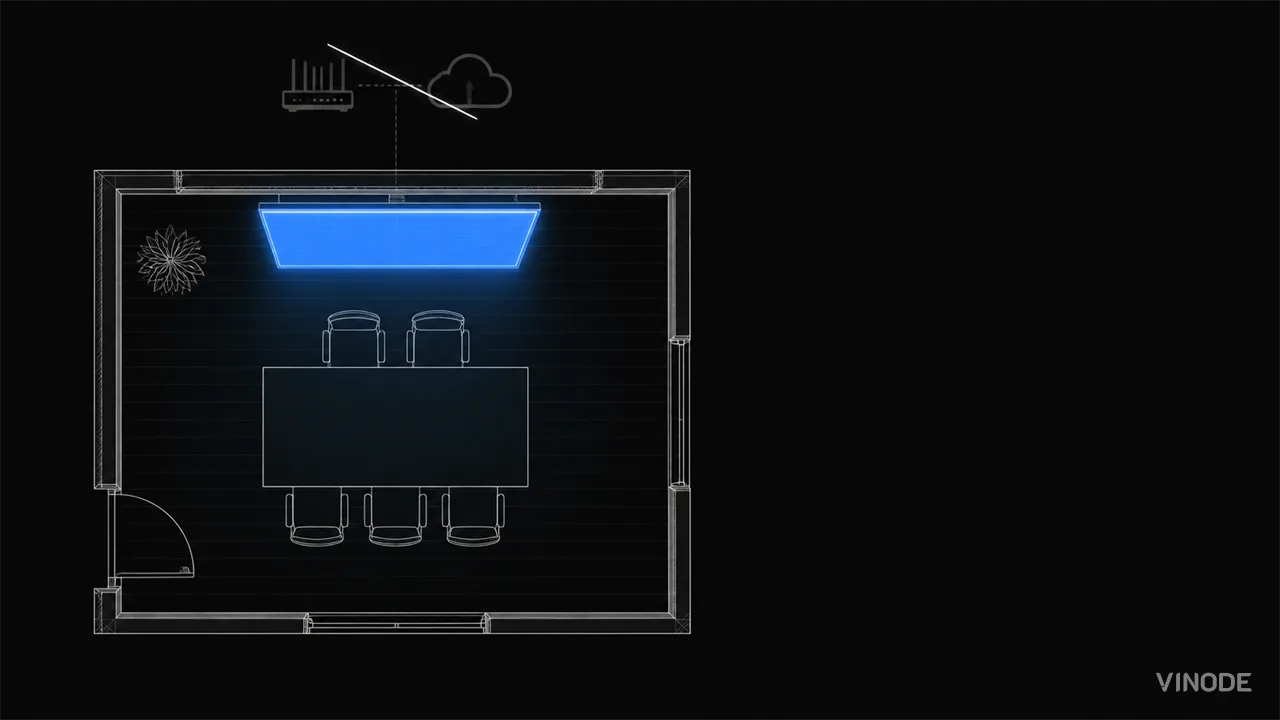
At six units the payoff isn't on the floor. It's that every buyer walks out with a brochure built for the exact unit they were looking at, on a block too small to warrant a scale model.
How to judge the switch
Judge the switch by what it does to the daily floor workflow, not by how the demo reads in the meeting where you decide. Two things are easy to get wrong in that meeting. The tier you are picturing may not be the tier you are quoting for, because the offline kiosk that carries the floor transformation ships one tier up from the entry package; confirm the kiosk is in scope before you sign. And since the browser stops short of the reservation, someone on the floor has to be the person who completes it. If nobody owns that step, the deal that felt closed in the chair walks back out the door.
The third thing to get right is how you read the numbers, including ours. Treat any lift figure you are shown as directional. Here is our own, with every caveat attached. It is one anonymized client's CRM, one campaign on the same development at the same price point, n=1, not a controlled trial, and we would not generalize it to yours. The stat below carries the figures: the overall visitor-to-closed-sale rate rose after the switch to Vinode, and the compounding hides one stage that slipped while it happened.
A single anonymized development, n=1. The overall lift compounds small stage gains; the offer-to-close stage actually fell about 11%. Read it as one data point.
Source: Vinode measurement - as of
The novelty of the demo wears off within a month of launch. Two operational changes are still doing work a year later: the agent seated beside the buyer instead of crossing the room for boards, and the sold-and-reserved list that maintains itself instead of waiting on a reprint. Those are the parts you are actually buying. Staff the floor so the human close does not fall through the gap the browser leaves, and judge the tool on the workflow it changes rather than the theatre.
See it running on your own phone first
Open a live Vinode development on the worst device you can find, then decide whether the floor changes are worth it for your project.

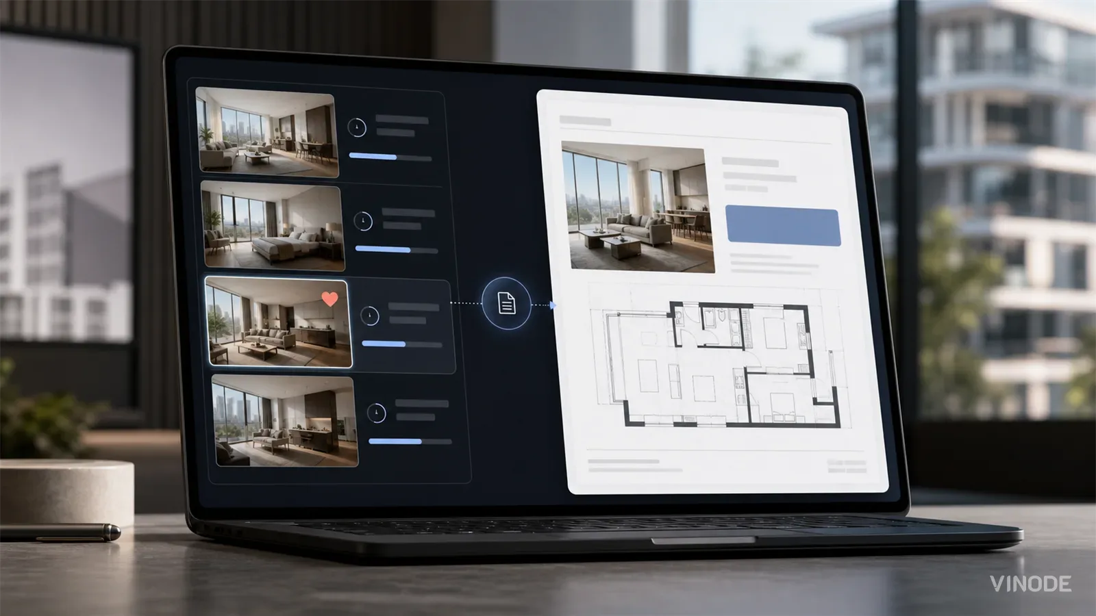
The Unit-Specific PDF a Buyer Actually Asked For
A buyer spends nineteen minutes on one two-bed, saves it, and gets the forty-one-page development brochure the next morning. Once a sales platform records the unit a buyer chose, the generic brochure becomes a decision to ignore that choice.

Expression of interest before release day: capture unit demand
640 names and no idea which side of the building they want. An expression of interest campaign pays off when the form is joined to the units each buyer explored, and each of these checks has a pass, a fail and a cost.

We measured when a pipeline crosses the presale line, not just whether it will
When GTHA opening-quarter absorption averaged 66%, the sold percentage was enough to forecast a presale crossing date. Then absorption fell to 17%. Three pipeline inputs produce the crossing date your lender asks for: stage-conversion rates, a cancellation haircut, and remaining inventory.