
Why buyers abandon a configurator that works perfectly
Key Takeaways
- Judge a configurator by how many buyers reach a deposit-ready choice, not by how much a buyer can change.
- The biggest leak is fragmentation: the decision scattered across a 3D page, a spreadsheet, a PDF form, and an email thread.
- Open on a buyable default, hold the live choices near four, and end the flow on one PDF the buyer keeps.
- Below six units, skip the deep configurator and spend the budget on filtering and a dynamic brochure instead.
A buyer opens your configurator on a Tuesday night. She spends eleven minutes swapping kitchen finishes, rotating the living room, holding the darker floor against the lighter one. Then she closes the tab and never contacts sales. Nothing broke. The 3D loaded fast, the finishes looked photoreal, every control did exactly what it promised. She just never finished.
The reflex is to read that as a lack of interest, but she stayed engaged for a full eleven minutes. Interest was never what stalled her. Completion was, and completion is measured differently from attention.
The instinct that fails here is to add power: more finishes, more layouts, more control, on the theory that a buyer who can change everything must be the more engaged one. That reliably buys engagement. Whether it buys completion is a separate question, and the jam-study evidence suggests the extra power often works against you. Iyengar and Lepper set a tasting table of 24 varieties next to one of 6; the larger table pulled more passers-by yet sold far worse at the register (reviewed in On the advantages and disadvantages of choice, PMC 2024).
Worth stating plainly, because it's usually oversold: choice overload isn't a universal law. It shows up under specific conditions, and the same review is explicit about which ones. It depends on how complex the options are, how much time the chooser has, and how clear their preferences already are. An off-plan property purchase happens to max out all three: complex options, real money on the line, and preferences that barely exist yet because the home doesn't either.
From Iyengar and Lepper's tasting-table experiment, reviewed in PMC, 2024. Read it as a lab analogue, an illustration of the mechanism.
Fragmentation is where buyers stall
Ask where buyers actually stall and the honest answer is rarely "the ninth finish." It's the seams between tools. The unit lives on a 3D page. The price sits in a spreadsheet the sales rep guards. The customization goes onto a PDF form. The financing question becomes an email thread that waits on a reply. Each of those is a separate place, with its own loading state, its own login, its own person on the other end. A buyer who was happily rotating a living room a minute ago is now waiting on someone to send over a pricing sheet, and the momentum that carried her through the enjoyable part rarely survives the wait. Every seam is a handoff, and a handoff is the easiest place in the world to quietly give up, because abandoning there costs the buyer nothing and looks like nothing.
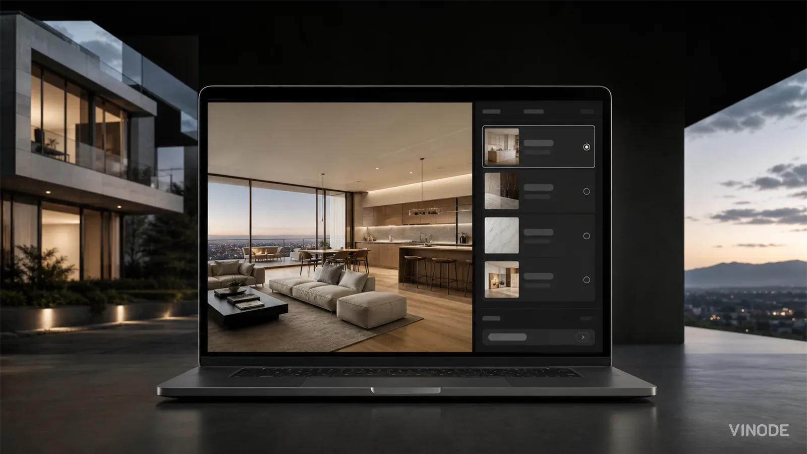
When Vinode rebuilt the sales experience for River Residence (the developer is Rubik, in Bulgaria), the move that mattered was collapsing those disconnected spreadsheets and PDF forms into one real-time flow: the buyer configures the unit, adds parking, chooses the kitchen, and reviews financing in the same place, on the same screen, with no downloads and nobody to email. The finish count stayed the same. What dropped was the number of separate systems sitting between a curious visitor and a decision she could act on, and for that customer, closing those gaps moved the outcome.
That reframes the drop-off problem, and it forces an honesty I'd rather keep than break. It's tempting to publish a tidy funnel with a number at every step, "X% quit at finishes, Y% at financing." We don't have those numbers for a Vinode project, and inventing them would poison everything else on the page. What we can name is the shape of the leak: a flow hemorrhages at its transitions, inventory to unit, unit to finishes, finishes to add-ons and financing. Each transition is the moment a buyer either continues inside one system or gets bounced into another. The vendor "68% abandon from choice overload" stats that circulate in search are unsourced; treat them as decoration. The mechanism they gesture at is real enough, but the exact percentages aren't evidence of anything.
Reveal the unit before the finishes
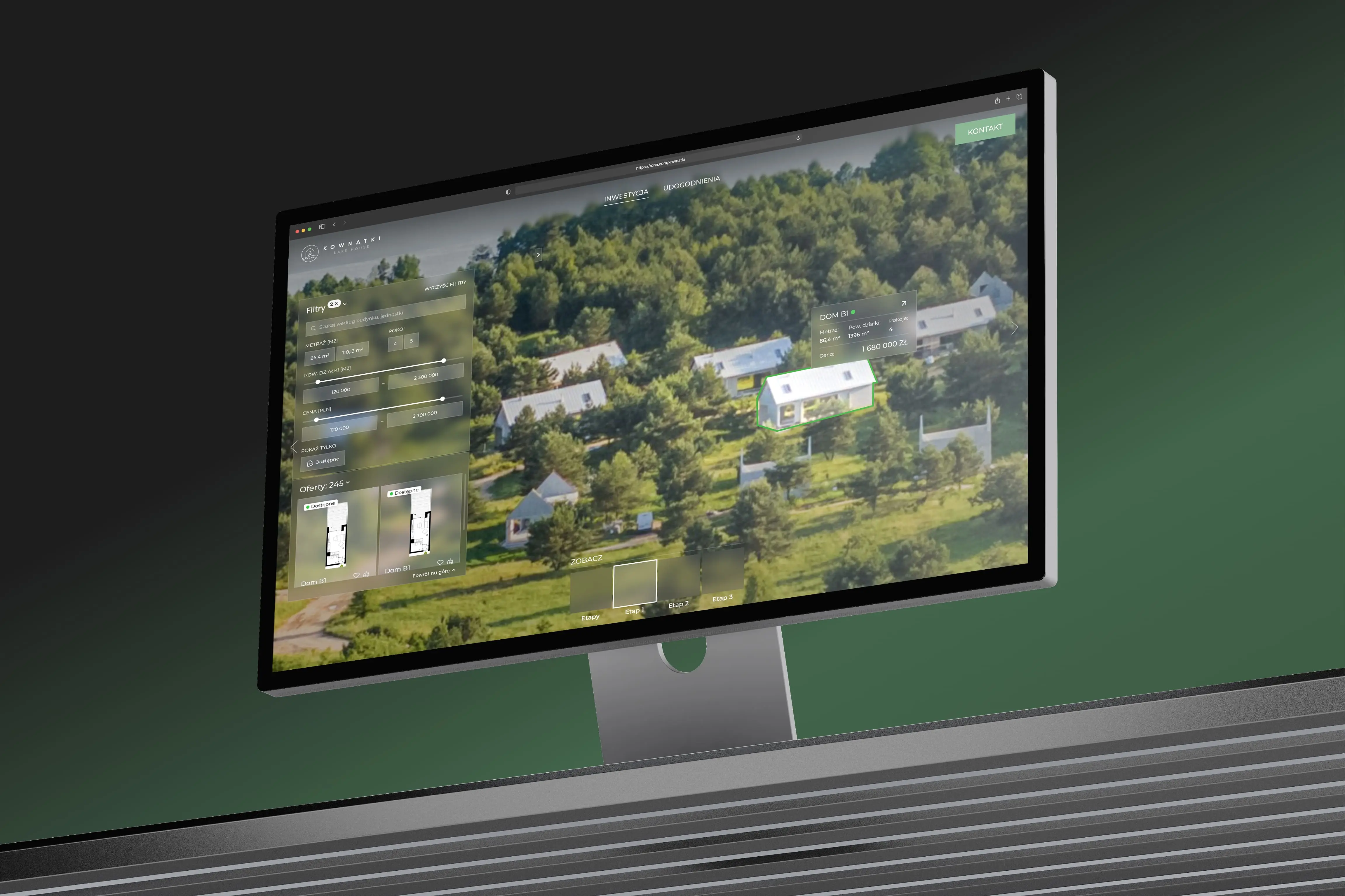
The fix is progressive disclosure, an unglamorous term from Nielsen Norman Group for a simple habit: surface the few most important options first, and defer the rest to a later screen (NN/g). For property the order writes itself. Development, then building, then unit, then interior, then finishes, then add-ons. Vinode already runs this one layer up, at inventory, where smart filters narrow a large set by building, size, price, rooms, floor, orientation, terrace, or parking before anyone configures a single unit, the same discipline behind interactive floor plans. The configurator pushes it one level deeper. Below the inventory sits a design fork worth settling deliberately.
Guided disclosure vs open sandbox
Guided disclosure
Reveal choices in sequence, one layer at a time, with a sensible option already selected at each step. The right default for off-plan buyers who don't yet know what they want and need the tool to shape the decision.
Open sandbox
Every control exposed at once, the buyer free to poke anywhere. Genuinely good for browsing the development in 3D. A poor fit for the purchase path, where it just multiplies the decisions sitting between a visitor and a deposit.
Why a blank-slate configurator loses buyers
That fork sets up the strongest opinion in this piece: a configurator should open on a valid default, never a blank slate. The blank slate feels generous. It seems to say "make it yours." What it actually does is offload every decision onto the buyer before they've seen anything worth finishing, and that's precisely where small projects lose people.
Defaults aren't cosmetic. Johnson and Goldstein's work on organ-donation forms showed that whether the form is opt-in or opt-out, purely the pre-selected state, swings enrollment dramatically (Science, 2003). The starting state is a design decision with real force behind it. A configurator that opens on a sensible configuration, a popular finish, one parking space, a standard kitchen, means that "do nothing" already produces a buyable result. Every pick the buyer makes after that adds to something already worth owning.
Because a pre-selection nudges behaviour, the temptation is to default buyers into paid add-ons they never asked for. With high-value property buyers that's a dark pattern, and the trust cost lands later, after they notice. Default toward the sensible baseline, and leave the upsell for the buyer to add deliberately.
Cap the live choices near four, curate whole interior styles
There's a real number behind "a handful," and it isn't the folk "seven." Miller's famous 7+/-2 has been quietly revised down; Cowan's work puts the practical limit closer to four items in working memory once you control for rehearsal (Cowan retrospective, PMC). So the workable rule is to keep the live, simultaneous choices near four rather than a screen full.
Then curate whole states. River Residence ships three interior styles instead of a paint-mixer with infinite sliders: Modern minimalist, Classic elegance, and Industrial chic, each one re-dressing the entire apartment in a single click. A buyer can weigh three finished rooms against each other in the time it takes to form an opinion. Hand her a dozen raw sliders instead and you've handed her a small project to manage, which is the kind of thing people put off and then never come back to.
A buyer who accepts a curated style in one click walks into the sales call with the decision already made. That changes what the call is for.
One flow for unit, price, add-ons and financing
If fragmentation is what drains a buyer, consolidation is the repair. Everything needed to reach a decision now lives in a single continuous flow, so the momentum a buyer builds while exploring doesn't break to fetch a price or a form. Four concrete mechanics keep that flow intact, each one closing a specific seam that used to leak.
- One flow for the unit, add-ons, financing, and summary, so there's no tab to hop to and no rep to email mid-decision.
- A running price that updates on every pick, so no choice hides a cost the buyer discovers only at the end.
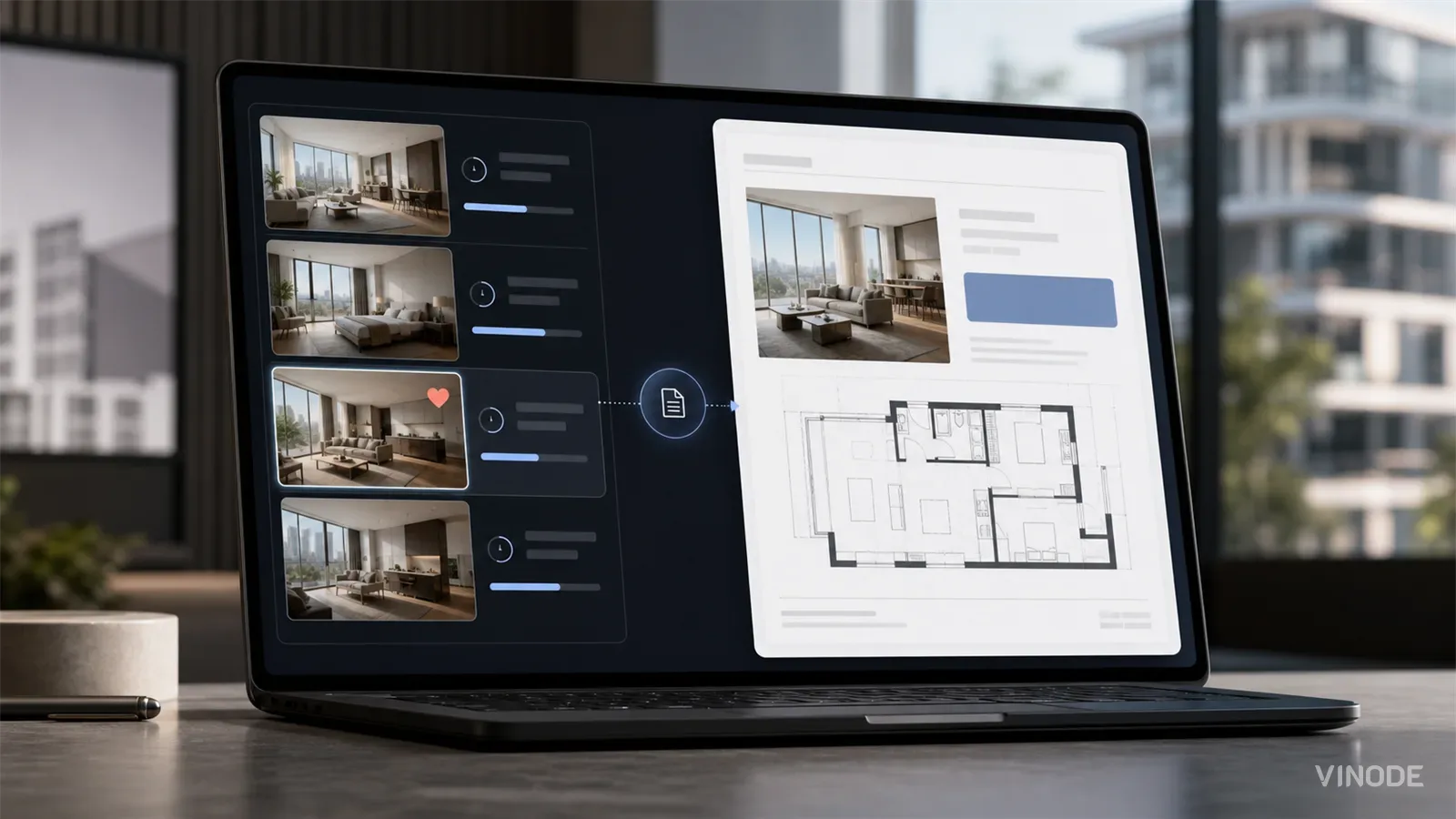
- A concrete artifact to leave with. Vinode auto-generates a dynamic PDF for the chosen unit: floor plan, current price, and saved preferences in one brochure the buyer keeps.
- Sold and reserved units that drop out automatically. On the Kownatki development the Back Panel removes unavailable homes from view, so a buyer never spends a decision on a unit they can't actually buy.

Two honesty notes on that artifact. The first: it saves the chosen state. Buyers can shortlist favourites and download the house card or PDF, as on Kownatki and the 110-unit St. Gallen inventory. Resuming a half-built configuration later, mid-edit, is a separate feature, and not one to market until you can ship it.
The second: the self-service version, where a developer's own team builds this configurator in a no-code editor, is still rolling out, with the broader release planned for Q3 2026. River's configurator was a custom Prographers build, and that custom path is what a buyer can evaluate today. This post covers the decision flow; the rendering underneath it gets its own post.
When six units don't justify a configurator
Here's the part most configurator content skips: sometimes the right configurator is no configurator. If you're selling six units or fewer, a deep layered configurator is usually the wrong spend. The buyer pool is small, the build is not cheap, and each extra option is decision surface for a handful of people who could just as easily pick up the phone.
For a boutique development at that scale, the budget does more work on smart filters and a genuinely good dynamic PDF, the same two mechanics that carry the top of the funnel anyway. Vinode's own packaging reflects this: the small tier leads with filters, interactive 3D, and the dynamic brochure rather than a layered configurator. Build the deep flow when the inventory and the decision complexity actually justify it, which for most projects starts well above the boutique tier.
The default test: would a buyer who touches nothing take that unit?
Here's the audit that replaces counting features. Ask one thing: if a buyer touches nothing at all, does the tool already put a unit in front of them they'd put a deposit on? A yes means the default did its job and the buyer spends the session refining a real choice. A no means they have to assemble something before there's anything to buy, and most won't. Set the default so the answer is yes, hold the flow together so no decision leaks into a spreadsheet, and hand the buyer a PDF on the way out. Everything else in a configurator is secondary to those three moves.
See a configurator built this way
River Residence runs entirely in the browser, no app and no download. Open it and watch the flow hold together.

The Unit-Specific PDF a Buyer Actually Asked For
A buyer spends nineteen minutes on one two-bed, saves it, and gets the forty-one-page development brochure the next morning. Once a sales platform records the unit a buyer chose, the generic brochure becomes a decision to ignore that choice.

Expression of interest before release day: capture unit demand
640 names and no idea which side of the building they want. An expression of interest campaign pays off when the form is joined to the units each buyer explored, and each of these checks has a pass, a fail and a cost.

We measured when a pipeline crosses the presale line, not just whether it will
When GTHA opening-quarter absorption averaged 66%, the sold percentage was enough to forecast a presale crossing date. Then absorption fell to 17%. Three pipeline inputs produce the crossing date your lender asks for: stage-conversion rates, a cancellation haircut, and remaining inventory.