
Your unit selector is already a lead form. Most sites throw it away.

Key Takeaways
- Every filter a buyer sets is a qualification answer she hands you for free: budget band, bedrooms, floor, outdoor space, availability.
- Default to the spatial view: burying the map or 3D model one click deep means most buyers never see it.
- Show sold and reserved units honestly as live states rather than hiding them to fake scarcity.
- Fire the next step from the chosen unit so its context reaches the rep, and judge the selector by that lead, not pageviews.
A buyer spends eleven minutes on your development site. She opens building 3, climbs to the fifth floor, filters to two-bedroom flats around 60 square metres, checks the box for a balcony, and hides everything already sold. By the time she taps the flat she wants, she has answered five of the questions your sales team pays to ask on a first call: budget band, size, floor, outdoor space, and that she only wants what is actually available.
Then she clicks Enquire and lands on a blank contact form. Name, email, message. The unit she chose is gone. The five answers are gone. On Monday a rep picks up the lead and starts qualifying from zero. That handoff is where the lead leaks, and almost every development site has it.
The eleven-minute, five-filter buyer isn't a fiction. On one of our developments, visitors averaged nearly seven page views per session, opening unit after unit before they enquired. Anonymized, from our own GA4.
Source: Vinode measurement - as of
A filter is a qualification question in disguise
When a buyer sets two bedrooms, ground floor, with a garden, she is telling you exactly who she is and what she can buy. The unit selector is the lead form, and what it produces is a shaped answer to the question every sales call opens with: what this person wants and whether they can afford it.
So build the controls around the buyer's real decisions. Buyers ask five things: what it costs, how many bedrooms, which floor, what is outside the window, and whether it is still for sale. A handful of controls built around those questions will out-qualify a wall of toggles that mirrors your inventory. The shape of those controls decides the outcome. Their number barely matters.
St. Gallen, a rental development of 110 apartments across several buildings, is the clean version. It makes a building-first drill-down the entry point, then promotes the two things renters there actually fight over: a garden-access toggle that shows only ground-floor flats with their own garden, and a balcony-size filter. The feature tenants care about most sits one click from the front door, and availability reads live, not from a stale export.
The opposite failure is well documented next door. Baymard, testing e-commerce product lists, found that 38% of sites don't offer filters for information they already show in the listing (Baymard). Buyers can see an attribute but can't narrow by it. Same cure as the too-many-filters problem: keep the controls the buyer is actually deciding on, and drop the rest.
Default to the spatial view
The second decision is what a buyer sees first. Most development sites open on a list of units: number, floor, size, price. It mirrors the spreadsheet, and it hides the one thing a spatial product exists to show, which is where the unit sits, what it looks out on, and how high up it is.
Baymard's accommodation-search study is the useful signal here, though it covers hotel and rental search rather than new-build sales, so treat the figures as analogous UX evidence. When the spatial view is a second click, most buyers never take it. Make the building or 3D model the default, and keep the list as the alternate view.
Versus a List-View default, where 65% of users never used the map at all (Baymard).
This matters most on a phone, where a filter panel and a map fight over a few hundred pixels and usually both lose. Safa Al Fursan puts 528 units across 25 buildings behind one-thumb navigation, so a buyer can narrow the field and move between duplex floors without a keyboard. Vinode manages that partly because it pre-renders the 3D and streams it as video, which the platform says loads in about two seconds and runs on low-powered phones, rather than computing every frame on the device. That load figure is Vinode's own claim, and it is the enabling condition behind a 3D tool sales teams don't abandon: a spatial selector is worthless if it won't open on the mid-range phone a buyer actually holds. (The rendering argument gets its own post: pre-rendered 3D beats real-time.)

Show availability honestly, even when it costs momentum
When a unit sells, you face a choice most teams make without noticing it is a choice. You can hide the sold unit, or you can show it as gone. Hiding keeps the grid looking full and manufactures a little scarcity. Showing it costs a flash of momentum, because the buyer watches the corner flat she wanted turn into someone else's. Take the honest side anyway. Free, reserved, and sold belong in the selection journey as first-class states, read live from the back panel so the screen never contradicts the sales office.
Kownatki, a lakeside estate of 20 detached houses released across three build stages, handles the hardest version of this. When a home sells, its listing falls back to price on request, and houses in an unreleased stage carry no teaser prices that aren't real yet. There is an upside hiding in the honesty. A buyer who sees three of five homes in a stage already sold reads that as proof the thing is selling, and real scarcity tends to persuade harder than the manufactured kind. No study I'd trust settles whether showing sold helps or hurts conversion, and I stand on the side where the buyer can believe what the screen tells her. If your development genuinely runs on manufactured scarcity, take this as an argument to push back on rather than a settled call.
Kill the detour: fire the next step from the unit
She has narrowed to one flat and she is ready to act. Here is where most sites break. The Enquire button lifts her out of the unit she just chose and drops her on a generic Contact us page that starts the conversation over. The fix is structural. The next step should fire from the unit itself, in its context, carrying what she chose, not send her off to a page that has forgotten everything the last eleven minutes established. Everything upstream, every filter and every default, exists to reach this instant with the qualification intact and hand it over without dropping it. The concrete test is narrow: what survives the click, and what lands on the rep's screen the moment she enquires.
What the handoff must carry
The unit itself
Building, floor, and unit number. Which door she stood at, down to the number.
The price she saw
The figure shown on that unit, so the rep and the buyer open from the same number.
Floor and orientation
How high up, and what the windows face. Half the reason she chose it.
Outdoor space and extras
Balcony, garden, parking. The toggles she bothered to set.
Availability state
Free or reserved at the moment she enquired, so nobody chases a sold home.
What else she compared
The units she weighed before deciding. Context a cold form can't capture.
Here is what Vinode's version actually does. When a buyer selects a unit, the platform generates a personalised PDF for that specific flat, carrying its floor plan, current price, and saved preferences, so the document that reaches the desk is already about a named unit: a specific flat, with its own plan and its own number. The CRM records which units a contact viewed and how long they spent on each. It does not turn a buyer's filter settings into tidy qualification fields on a lead record. What it does is quieter and still worth having: the selected unit's context travels with the enquiry instead of evaporating at the form.
River Residence, built for the client Rubik, pushes the idea furthest by folding the next step into the experience itself. A buyer configures the real purchase in one flow, adding parking, choosing kitchen finishes, reviewing financing, all inside the unit view. The disconnected spreadsheets and PDF forms that used to sit between interest and action simply aren't in the path. That reframes the final click as an in-context enquiry: a request to view the unit she is already standing in, generated from that unit. (I've argued the case for connected plans over static PDFs separately, in interactive floor plans and the sales cycle.)
Judge it by the lead, then run the audit
So the real scoreboard is the lead itself. One enquiry that arrives as unit 4B, fifth floor, with the balcony, budget already fits is worth more to a sales lead than ten anonymous form fills that all open with "hi, do you have anything available." Time-on-page is easy to run up, and it tells you nothing about whether a visitor can buy.
This isn't for every project. A development of six units and a single price list needs no spatial selector or qualification funnel; one clear page and a phone number will out-convert all of it, and building more would burn the budget. The argument starts earning its keep further up, where enough units, floors, and states exist that a buyer genuinely has to choose, and the choosing is itself the qualification.
So run the one audit that matters. Open your own unit finder, pick a flat the way a buyer would, and click the next step: does your selection reach your sales team as context, or does it die at the contact form? If it dies, no amount of extra filters or better 3D will save that lead. Fix the last click first.
Audit your own unit selector
See how St. Gallen, Kownatki, and River Residence carry a buyer's choice all the way from the first filter to the enquiry.

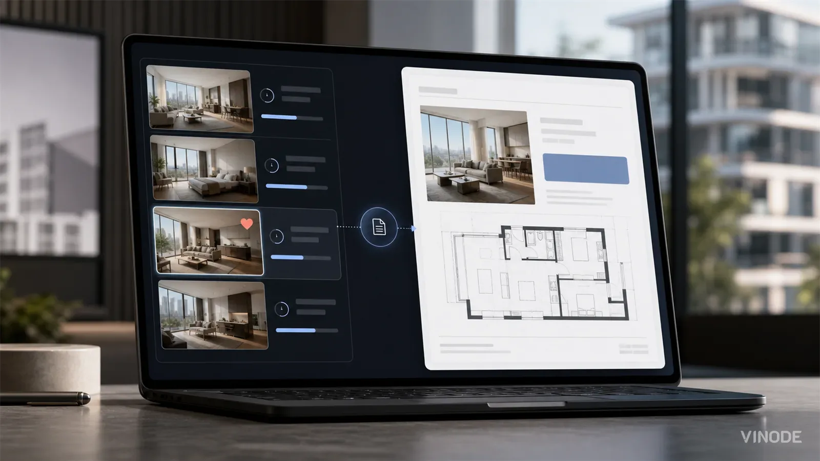
The Unit-Specific PDF a Buyer Actually Asked For
A buyer spends nineteen minutes on one two-bed, saves it, and gets the forty-one-page development brochure the next morning. Once a sales platform records the unit a buyer chose, the generic brochure becomes a decision to ignore that choice.

Expression of interest before release day: capture unit demand
640 names and no idea which side of the building they want. An expression of interest campaign pays off when the form is joined to the units each buyer explored, and each of these checks has a pass, a fail and a cost.

We measured when a pipeline crosses the presale line, not just whether it will
When GTHA opening-quarter absorption averaged 66%, the sold percentage was enough to forecast a presale crossing date. Then absorption fell to 17%. Three pipeline inputs produce the crossing date your lender asks for: stage-conversion rates, a cancellation haircut, and remaining inventory.